

Leinenkugel’s New SKU Packaging: Honey Lemon Light
Client
Leinenkugel’s
Agency
Soulsight
Role
Designer
Background
Leinie’s is known for their fun, festive, and fruit-forward beers.
The Jacob Leinenkugel Brewing Company, also known as Leinenkugel’s or Leinie’s, is an American beer maker based in Chippewa Falls, Wisconsin known for their fun, festive, and fruit-forward brews. The company is the seventh oldest brewery in the United States, having opened in 1867, and staying in business even through Prohibition. Though it now resides under the umbrella of Molson Coors with national distribution, its personality and brand remain constant.
Leinenkugel’s produces a wide range of beers—from traditional varieties, like lagers and ales, to more craft style recipes, like weiss, IPAs, and shandies. Their latest launch is Honey Lemon Light, available January through September.
Brief
Create packaging for Leinie’s latest flavor offering: Honey Lemon Light.
The client asked us to design primary and secondary packaging for Honey Lemon Light that was brand resonant, stood out on shelf, and fit within their existing portfolio of beers, while differentiating from other offerings in the family with an adjacent flavor profile.
Compared to others in the portfolio, Honey Lemon Light is not heavily fruit-forward, but rather minimal, so it was important that the new package design communicated this lightness in flavor. The client also wanted to position HLL as a more health-conscious choice, with only 99 calories, so a successful solution needed to find a way to highlight this.
Leinenkugel’s existing portfolio of beers in 12 oz. bottles and 12 oz. cans.

Solution
While we explored several ways in, covering a wide range of solutions that ran the gamut from closer in to farther out from the rest of the portfolio, the client ultimately decided they felt most comfortable fitting Honey Lemon Light into the collection with a packaging concept that felt close to home. Our final solution leveraged brand equity while establishing new SKU differentiation, by incorporating all necessary brand elements and including new color and flavor cue communication that appropriately embodied the character of Honey Lemon Light.
Primary & secondary packaging
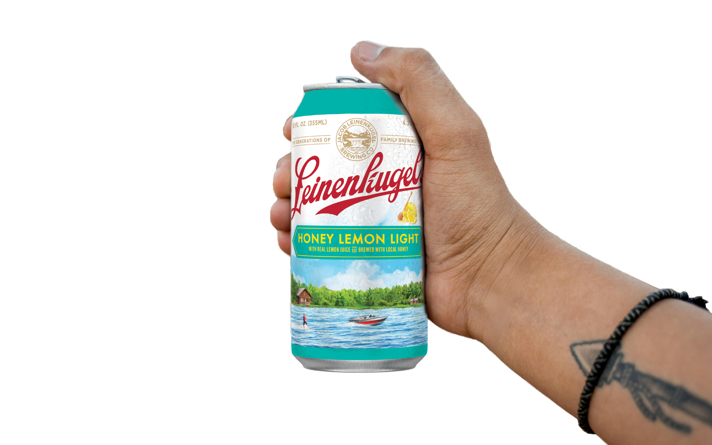
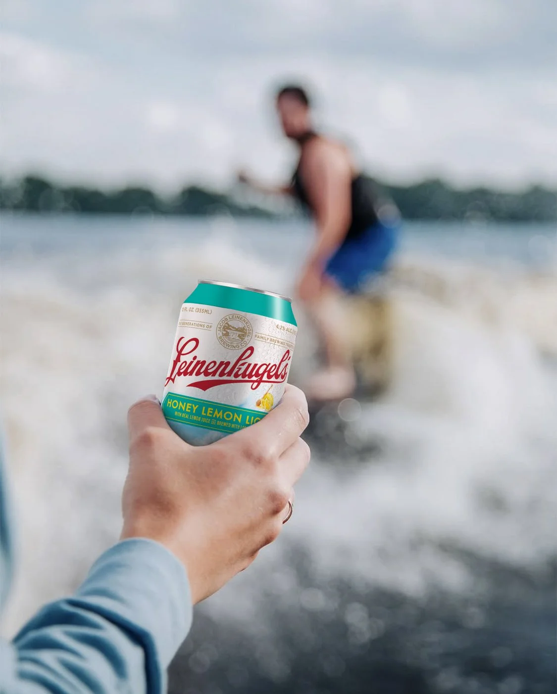
Certain elements are consistent with the portfolio to retain brand equity, like The Credentialied Logo with the gold seal that cues heritage and craft credential, the scenic background that connects with the outdoor drinking occasion, the flavor cues that communicate flavor profile, the centrally-located hexagon flavor plaque that supports an easily shoppable system, and—on the secondary specifically—the pour shot that signals refreshment and drives appetite appeal.
While Honey Lemon Light needed to fit seamlessly into the full family of Leinenkugel’s beers, it also needed to be able to stand apart from similar flavor profiles Summer Shandy and Honey Weiss. The combination of the unique light lager glass, updated flavor cues, honeycomb calorie bug callout, and a bold new color helps to strike this differentiation.
The pack as a whole needed to present well when grouped and stacked, as commonly displayed in grocery and liquor stores.
Each flavor of the Leinenkugel’s brand utilizes a specific color code to complement the beer type and flavor, and to increase shoppability across the portfolio. Honey Lemon Light’s bright and optimistic teal communicates both the lightness and ease in its flavor as well as the warmer weather occasion for drinking it.
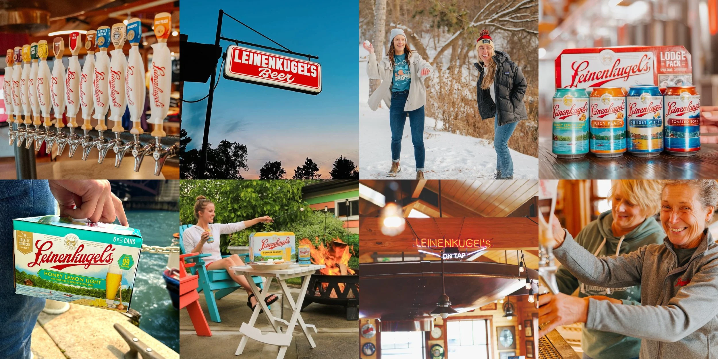
Social & brand world
Team
Steve Tedesco, Creative Director
·
Gina Grittner, Design Director
·
Jess Cohen, Designer
·
Erin Acklin, Designer
·
Steve Tedesco, Creative Director · Gina Grittner, Design Director · Jess Cohen, Designer · Erin Acklin, Designer ·